Week 4- Show & Tell
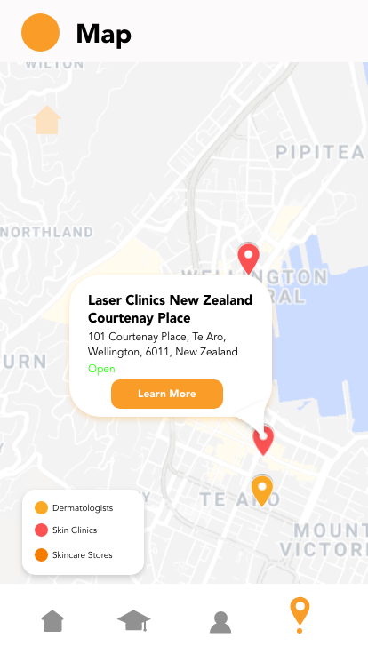
This week was our show and tell. Below is the app design I have crafted at this stage. It is a relatively low-fi in mockup. In this iteration, I have additionally brought in the use of videos, this is due to the research that I have about how 19-24 year olds engage with content and as this is my target audience, I want this to be essentially focussed towards them.


In this feedback, they acknowledged that the data visualisation which I had in place was a little too clinical and hindered engagement.
They also recognised a significant issue which was languaging. This allowed me to recognise that language which is relatively common to me, isn’t necessarily as straightforward for others.
The below was the prototype they tested.


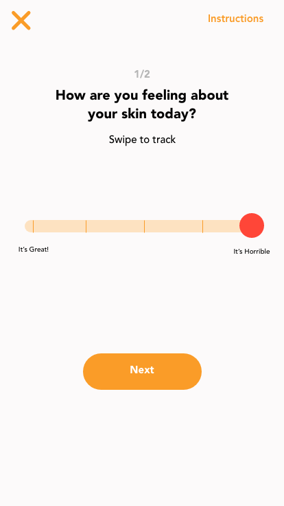


Additionally, I felt it critical to this week do my first round of user testing with one of my acne sufferers. This is what Claudia had to say.


She liked the idea of having bitesized chunks of tasks to do as it makes the app more approachable, but also noted that it would be slightly better to see a more hi-fi prototype, especially one where the user could scan their own face, in order to engage them more with the prototype and gain more feedback.


Comments
Post a Comment